Resale Style: Kate plays store!
Sharon Roy, who together with husband Ron owns Yesterday's Memories in Venice
FL, was kind enough to let me come to her shop with my camera and some
ideas I want to show you all. Kind of an Extreme Makeover, Resale
Style!
Yesterday's Memories in Venice
FL, was kind enough to let me come to her shop with my camera and some
ideas I want to show you all. Kind of an Extreme Makeover, Resale
Style!
The Roys bought this shop in 2001. Along with the business, they got Star Staffer
Linda Wampner, and with the help of Maureen Maigret (who kept the shop
functioning this day as we three played store), these folks run a shop
which has expanded into all four storefronts in a double-sided commercial
building in downtown Venice. The shop is now 4000 sq. ft., and carries
womenswear, menswear, household decor and furniture.
Sharon was thinking, she said when I got there, of
eliminating the knick-knacks from the shop. They're just not selling, she
said, pointing out the three glass-and-chrome shelving units right as
customers enter the store.
Well, as you know, Kate's never one to suggest you stop
carrying a category without a fight! So we decided we would try
remerchandising those little shelf items to see if, perhaps, we could sell
more.
|
Follow us as we....
| Rearrange a focal point....
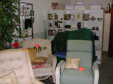
Standing in the entry to the shop, looking past
the glass-shelf area, this is what a shopper sees. The three white
shelving units form a wall that "hides" the shop's
kitchen/storage area, but unfortunately, the shopkeepers had gotten
used to thinking of it as a wall, not as a display piece directly in
the shopper's first glance. Under that
forest green cloth is a stack of plastic bins filled with several
consignors' incoming which had not been checked in yet. If
you must have unsalable piles of incoming in a public
area...at least put them in the least usable area!
|
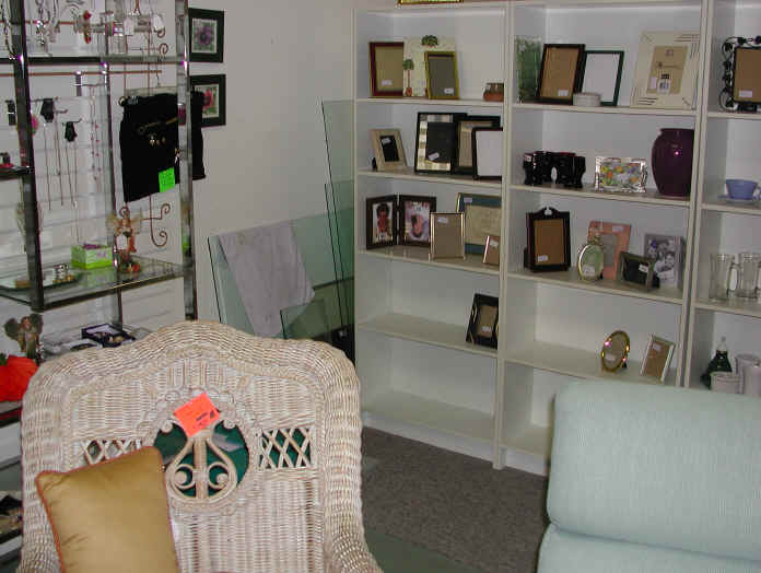
So the first thing we did is move the stuff out of
the main area of the shop. The glass and chrome unit on the left of
this picture held some of the shop's jewelry, but it's doubtful that
was seen often, since the (for-sale) silk tree blocked the view of
it. |
| Making room for
work...and for browsers.
Since
there was nowhere to store the extra glass shelving without a major
revamp of the shop, we killed
two birds with one silk tree: moved it between the two units, which made the jewelry shelves more visible, and the stored
glass shelves (almost) invisible. Now let's take a look at what the
shop had on this focal-point area:
Picture frames. Priced from $1 to around $6.
Boring, inexpensive, and visually unappealing. Let's banish
the less-expensive unexciting stuff to some lesser area. Let's figure out what we can
put here instead. What will draw customers into the shop,
get them involved touching and feeling, and stimulate their browsing
hormones? Color! Bold silhouettes! A melange
of things that will draw customers into the midst of your wonderful
store and start them thinking, "That's right, I
need one of those!" |
 |
| An hour later, this is the
beginning of their holiday department
This makeover was done in mid-October, so the shop didn't
have a lot of holiday decor items in yet and we had to make do. We
filled in the gaps with white-and-gold china, wine glasses and
serving pieces for entertaining. We still had available space, and
sparseness is not good. So we added items that would be good gift purchases (on
the lower right, some bath products. On the left, pre-boxed Lenox
gift pieces.)
We softened the geometry of the shelving with
some for-sale crochet pieces and hung the one stocking to break up
all right angles.
Notice that we filled the top of the
units with merchandise, too. This serves several purposes: more
space, more reason for the browser to head deeper into the shop and it distracts the eye from the
refrigerator behind. We
chose things that wouldn't be dangerous if they fell, as well. Linda
really loved the way the sparkly silver top "lights up that
whole area!"
We used a plate stand to give one cubicle a bit of
height, and stood a dinner plate or two on end for the same reason.
With some more time, we could have varied the heights of items as
well, using risers to give depth and interest.
The crew still has plenty of work to do in this
area (resale shops are always works in progress!) but they also
have a good head-start on a brand-new "department" in the
shop...one that had been more like a storage area before. |
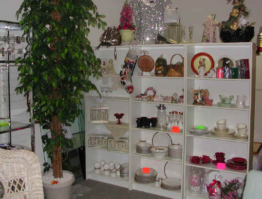
As the holiday items come in, the staff will have
to make some adjustments. Things not specifically holiday-only, such as
the sets of china, can be moved
elsewhere...unless they're already sold, which is our goal of
course!
Please
notice that we did not, and should not, use
"decorations" to create a holiday mood. Use the
merchandise that's for sale only. (Well, if you want to add a luxe
green velvet bow to the red china, that's okay; the point is, do not
distract from your for-sale stock!)
|
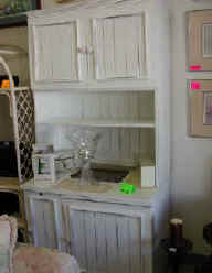 We decided to make this for-sale
cupboard look more appealing. Shouts European country to me, doesn't
it to you? But putting clear glass items and boxed goods on the
cupboard doesn't make a browser think I love that cupboard,
gotta have it, can't live without it! We decided to make this for-sale
cupboard look more appealing. Shouts European country to me, doesn't
it to you? But putting clear glass items and boxed goods on the
cupboard doesn't make a browser think I love that cupboard,
gotta have it, can't live without it! |
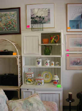 All
we did was add brightly-painted pottery and open the top to
give the area some depth and show off the shelving feature. We
plopped a birdcage on top, and with more time, we'd have
rearranged the surrounding pictures to something more primary color
as well. All
we did was add brightly-painted pottery and open the top to
give the area some depth and show off the shelving feature. We
plopped a birdcage on top, and with more time, we'd have
rearranged the surrounding pictures to something more primary color
as well.
If we hadn't had bright pottery, what else could
we have used? Maybe a collection of blue-and-white ware, maybe an
artistic pile or two of cookbooks and a basket of kitchen towels. In
resale, it's all about Here today, gone tomorrow.
That's the fun of resale, both for those who work there and those
who shop there!
|
As we worked together to
do something more exciting with the bric-a-brac, here's what Sharon
and Linda and I talked about. For more tips, click the book cover to
get Shop Sizzle,
written specifically for the consignment, resale, and thrift
shopkeeper:
- Like items, displayed together, increase
appeal. If you catch a browser's eye with a lamp shaped
like a lighthouse, have a lot of lighthouse choices right there. She may not
have the need or the room for that lamp, but surely a lighthouse
picture frame, coasters, or handbag will fit into her home and budget.
- Layering and clustering makes space.
It was amazing how just a few hours' work made so much more room in the shop. We "layered" (put things slightly
in front and behind each other, always keeping in mind the
breakage factor), and we clustered like with like. We even took
the hand mirrors, makeup selection and manicure sets and put them with the
jewelry, which needed some more interest.
- Adjacencies matter. On those
front shelves, which should showcase the best of the best in the
shop, was a miscellany of items that would be better played
down. For example, there were lots of "guy stuff": the kind of odds and ends that men find
more interesting than decorative plates and figurines. But
moving this type of shelf item (think poker chips, flashlights, calculators and
hardware) to the last room, next to the
menswear? Gives the guys a place to be happily occupied for a
bit longer than average...while their wives spend money.
- What are browsers likely to snap up? Since
Venice attracts a lot of tourists, we planned to fill those
front shelves with things that might remind shoppers of their
vacation such as shells, tropical bird and flower statuettes, or
nautical, golf, and beach memorabilia. Even better if these
items are easy to stick in a suitcase!
- Don't waste prime space on slow sellers.
Antiques and vintage items aren't big sellers here. So we planned to gather that type of item
(the antique rattan footstool, the old boxes filled with old
buttons, the 1930's figurines) in the farthest far corner, where
they'd look better together for the few shoppers who are
interested, and not "waste" space
that could be used for faster-turning-over goods.
- Finally, we figured out just
why the
knick-knacks were not selling on the glass units
right in the beginning of the shop: it was scary
to shop there! The shelves, being home units rather than retail
units, are flimsy and people were leery of them. And most of
all? They were simply too close together! There was no room to
move without fearing that your hip or your handbag would knock
something to smithereens. So shoppers didn't linger...and some
of them never entered...this most-valuable spot in the shop.
Sharon thought she might try removing one of the units to give
more elbow room, and I agreed that even with less space, she'd
probably sell more.
|
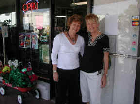 Linda,
left, and owner Sharon. Linda,
left, and owner Sharon. |
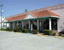 A lucky break: no cars in front when I went out to
take a picture! All four store fronts under the arcade are
Yesterday's Memories. Thanks for allowing me to use the shop as our Extreme Makeover, Resale
Style. A lucky break: no cars in front when I went out to
take a picture! All four store fronts under the arcade are
Yesterday's Memories. Thanks for allowing me to use the shop as our Extreme Makeover, Resale
Style. |
|
 |